A New Chapter for
Bookstores.com

Improving structure, clarity, and usability during an ongoing rebuild

Project Overview

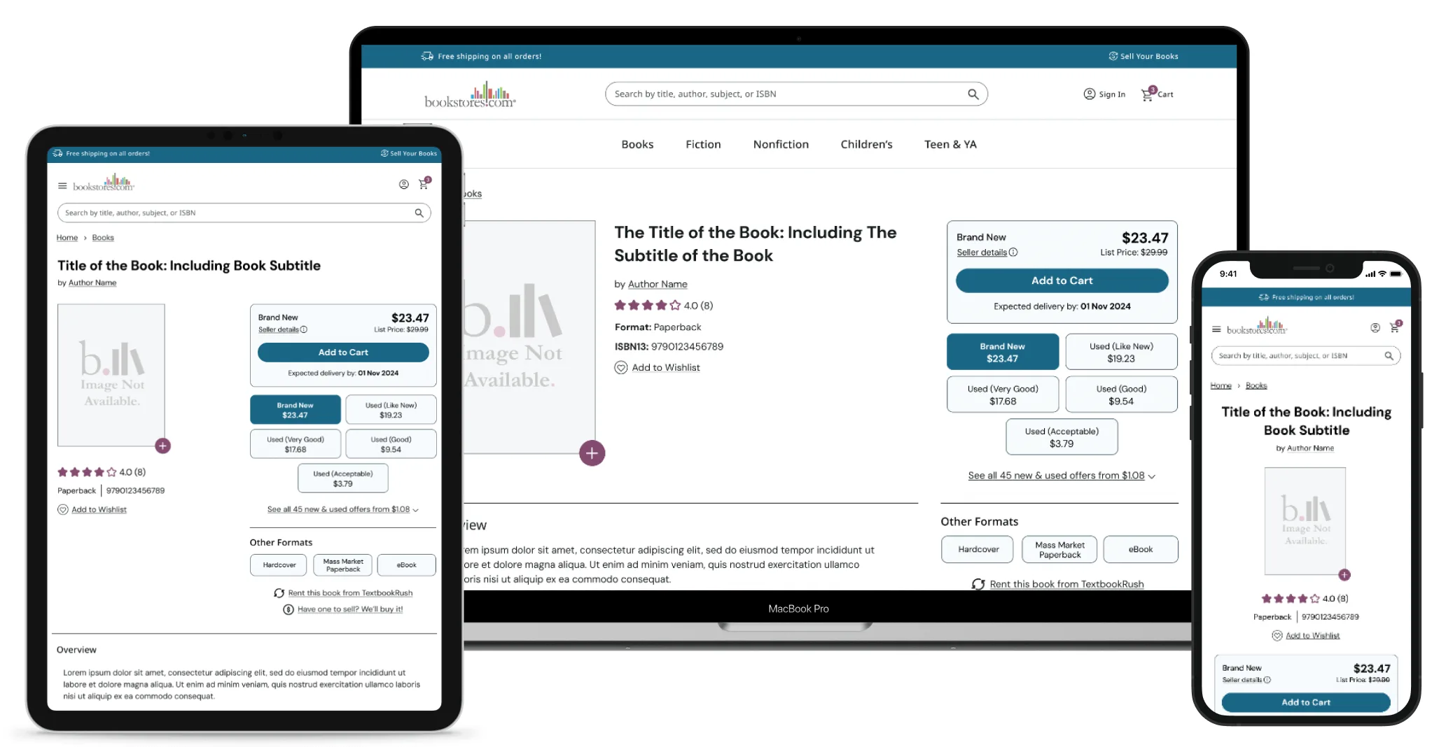
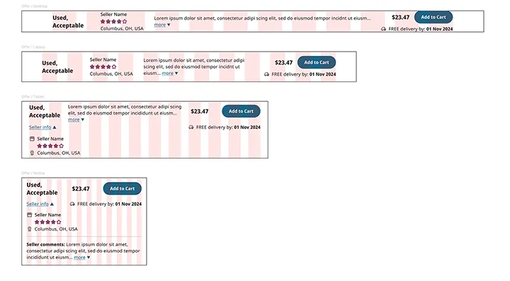
This project was part UX rescue, part design overhaul. Bookstores.com was the first of several sites slated to move off a legacy codebase into a modern framework. Developers had already started pushing changes live, but without any UX guidance. I stepped in to make sure the new version didn’t just look better, but worked better too. My goal was to refocus what was already in motion around real user needs and create a smoother, more enjoyable experience for book lovers of all kinds.

My Role

As the UX and UI Designer, I led research and design to realign an in-progress rebuild with user needs. I conducted behavior analysis, competitive research, and created personas and flows to guide structure and navigation. These insights shaped responsive wireframes and UI improvements in collaboration with developers and SEO stakeholders.

Objective

Refocus an ongoing site rebuild around real user needs through research-driven UX improvements. The goal was to enhance clarity, structure, and usability without slowing development momentum.

Responsibilities

Tools Used

Figma
Microsoft Clarity
Google Analytics
Google Search Console
Debugbear

Understanding the Problem

The site needed to serve a wide audience and help them find books and compare prices with minimal friction. But with devs moving fast and pushing updates without UX input, the site was evolving without a clear structure or purpose. I had to move quickly, assess the most urgent pain points, and bring a more cohesive, user-friendly experience to life.

Who We Designed For

Sample user persona used for Bookstores.com
One of the user personas used for Bookstores.com

Our target audience included a broad range of readers:

  • Casual readers looking for something new
  • Students searching for affordable textbooks
  • Bargain hunters comparing offers from different sellers
  • Book lovers who browse by topic or genre

I created user personas to represent our core audience segments. These helped guide design decisions around content structure, feature prioritization, and tone.

The UX Process

To get clarity on what users needed, I started with:

  • User Research – reviewing behavior patterns using Microsoft Clarity
  • Competitive Analysis – comparing similar websites for best practices
  • Personas & Flows – outlining who we’re designing for and how they might move through the site
  • Wireframes & Prototypes – iterating and refining in Figma

I also created a visual sitemap to organize the site’s flow and identify structural gaps. This helped ensure the new design supported key tasks like browsing, comparing offers, and checking out.

Sitemap of the Bookstores.com website
Visual sitemap for the updated website.

Design Process

Since developers were already pushing live updates, I had to design in parallel by adapting to what was already built while steering the structure toward better UX. This meant finding solutions that didn’t require rework or slow down the release schedule.
I started by reviewing what had already been pushed live, identifying weak points in usability, structure, and responsiveness. From there, I sketched out wireframes and jumped into high-fidelity mockups in Figma, focusing on mobile-first design and flexible layout patterns.

Design Highlights

Product Page

The initial product page lacked a clear hierarchy, was not mobile-friendly, and was filled with placeholder or missing content.

Screenshot of developer designed product page
Before: product page created by the developers
Screenshot of the Bookstores.com product page after UX updates.
After: product page wireframe with UX updates

I redesigned the product page to feel more organized and information-rich without being overwhelming.

Buyers can now quickly:

  • Scan key book info at a glance
  • Compare prices and seller ratings
  • Explore related titles effortlessly

Links to related titles, other formats, and different subjects were added to improve internal linking and to help boost SEO.

While wireframing the product page, I made sure that the layout was responsive so that users on any device can easily find the information they need.

I designed the layout so that the ‘Add to Cart’ button would be visible when the page loads, no matter the device being used. 

Screenshots of the updated product page on a laptop, tablet, and phone
Figma screenshot of the responsive layout for an offer listing.

I also spent a lot of time working on the layout for the ‘View All Offers’ section of the page. I did not want the user to be overwhelmed by data and choices, especially on mobile devices. 

Home Page

The developer-built home page lacked structure, content, and navigation. I redesigned it to be flexible, seasonal, and content-rich.

Screenshot of the old home page
Before: bare bones home page created by the devs
Updated home page wireframes
After: home page wireframes showing a modular layout for easy content updates

The new layout allows the team to highlight different categories, subjects, or promotions throughout the year. This not only improves SEO, but also encourages deeper browsing and content discovery.

The Outcome (Sort of)

I was laid off before the new designs were implemented and the updated site went live. The company chose to stop doing design in-house and move in a different direction. While that was disappointing, it also made this project a strong reminder of how valuable UX is, especially during fast-paced, in-progress redesigns. Jumping into a moving build, designing with constraints, and shaping a better user journey around what’s already live is no small task. It’s something I’m proud of, even if the live site today doesn’t fully reflect the work I did.